|
|
The natural reaction of traders during a stock market correction is to panic, but these charts should have you thinking otherwise.
Optimistic investors held out hope that the third week of trading would bring a rebound following the worst start to a new year ever, but instead they got red arrows pretty much across the board once again with the major indexes down around 10% so far this year.
To put it mildly, you could say most investors and short-term traders are worried. CNN has a tool known as the Fear & Greed Index that examines seven fear and greed indicators such as market volatility, put and call option breadth, safe-haven investment demand, and junk-bond demand and as of Friday, the index, which is ranked on a scale of 0 to 100, closed at a 10, or "extreme fear."
The only charts that really matters during a market crash
But for investors who focus on finding quality companies to hold over the long term, the past two weeks really shouldn't be too worrisome. Why? We believe the following chart of the S&P 500 tells you everything you need to know about the stock market:
CHART # 1:
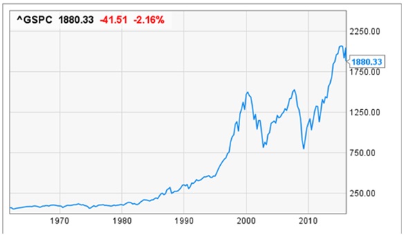
On the surface this 50-year chart probably doesn't look very exciting, and that's because it's really difficult to cram 50 years' worth of stock moves into a chart that'll fit on your computer or mobile screen. What you may not see in this chart is that between 1965 and
the end of 2015 the S&P 500 underwent 27 corrections of 10% or more (numbers were rounded to the nearest integer).
THE FACTS:
1. Corrections are actually really common. Not only are they common they tend to occur about every two years but they're often short lived; thus, the 10% decline this year isn't as abnormal as you might be led to believe.
2. Secondly, we spend more time in rising markets than we do during periods of correction. This is more of an extension of the prior point that corrections, while not uncommon, tend to happen quickly and be over with. Only with rare exception (the 2000-2002 correction, which lasted 915 days, and the 2007-2009 correction, which went on for 510 days) do corrections last a prolonged period of
time.
But here's the most important thing to note: The S&P 500 reclaimed the lost value in every single instance involving a correction of 10% or more. That's 27 corrections of at least 10% (again, rounded up) since 1987, and every single one of those corrections wiped out by a subsequent bullish rally. Sometimes it takes just weeks to wipe out the effects of a correction, or as you can see with the dot-com bubble of 2000, it took a good seven years for long-term investors to be vindicated once more.
The point here is simple: The 50-year chart above of the S&P 500 shows you the only thing you need to know during a market correction: that over the long run stock valuations tend to move higher. Since 1950 there have been 34 corrections of 10% or more, and every single correction has been eventually wiped out by
a bullish rally. This bodes extremely well for investors who purchase high-quality companies and hold them for long periods of time.
CHART # 2:
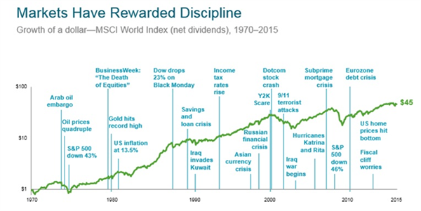
Buy-and-hold is still your best bet – The risks of market timing:
J.P. Morgan Asset Management, utilizing data from Lipper, examined the returns of the S&P 500 between Dec. 31, 1993, and Dec. 31, 2013, and made an intriguing discovery.
Despite undergoing two very steep corrections of 49% and 57% on the S&P 500, investors who bought and held those roughly 5,000 trading days earned more than a 480% return. That's a
figure that would handily outpace inflation over the long run, leading to real wealth creation. But here's where things get interesting: If you missed out on just the 10 best days over this approximately 5,000-day trading period, your returns fell from 483% to just 191%. Missing the 30 best days would cause your return to sink to less than 20%, or lower than 1% annualized.
The data suggests pretty clearly that staying invested over the long term is your best way to prosper, and that trying to time the market can cause you to miss out on some bad weeks, but also some very strong weeks, too. Missing even a handful of the market's strongest days could be the difference between retiring early, or perhaps many years later.
CHART # 3:
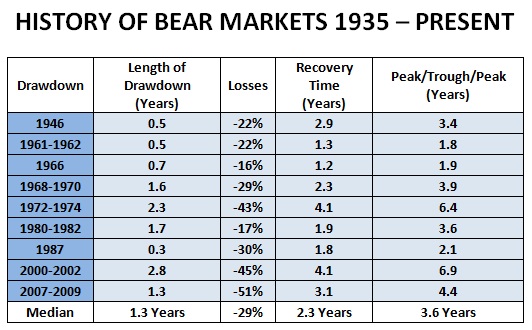
The median time to fully recover from market declines was 3.6 years and the longest period was 6.4 years.

THE BOTTOM LINE: We have seen this play before. The plot line changes but the play always ends the same way. History is solidly on the side of the bulls.
NOTE: PAST PERFORMANCE NOT INDICATIVE OF LIKELY FUTURE RETURNS. INVEST ONLY AFTER CAREFULLY REVIEWING ALL OFFERING DOCUMENTS UPON WHICH ALONE YOU SHOULD RELY. INFORMATION ABOVE IS HYPOTHETICAL, MAY NOT BE APPLICABLE TO YOUR SITUATION AND MAY CONTAIN INACCURACIES. FOR CHARTS # 1& 3 THE S+P 500 WAS USED AS A MARKET PROXY AND FOR CHART 2 TRADING COSTS AND TAXES HAVE BEEN IGNORED.
Commstock exclusively represents the RVW IntelliBeta Wealth System in Israel.
Not familiar with Smart Beta investing? why not schedule a discussion with us.
Coffee/Tea guaranteed , No commitment necessary

|
|
© 2016 Commstock Trading LTD |
|